February 10, 2016
Our tasks included developing a coherent concept, designing functional mockups and graphic designs for all Terma Group websites.
Terma is one of the largest Polish manufacturers of heating and medical products, construction
machinery and industrial services. The company planned to refresh its brand image on the Internet and
asked us to prepare functional mockups and graphic layouts for its websites. The order included the
implementation of projects for the most important entities of the company and the main corporate
website of Terma Group.
 Challenge The biggest challenge was to find an aesthetic framework for all services and to present the
extensive range of products in a visually attractive way, while maintaining high standards of website
usability. These assumptions applied equally to the appearance of pages on monitor screens and the way
they were displayed on mobile devices. The company attaches great importance to its mission, so the
agency's tasks also included capturing the most important values for it - Kashubian origins and
respect for nature.
 Solutions used We started the conceptual work by developing a well-thought-out information
architecture and planning navigation. During the work, we organized a series of meetings with the
client, during which we identified the needs of various groups of the company's clients, and its
employees selected visual proposals that best reflected the character of the company.
and brand philosophy. Together with the client, we decided that the websites would be built based on a minimalist, modern design. By using white, we achieved the impression of spaciousness and cleanliness. The complementary colors were black and red, the colors taken from the brand logo - combined with light fonts, the entire project acquired a solid, professional character. This concept has been transferred to all Terma Group websites. TERMA HEAT Terma Heat is the most important service of the group. It is addressed primarily to individual customers and serves as a virtual catalog of heating products. Due to this
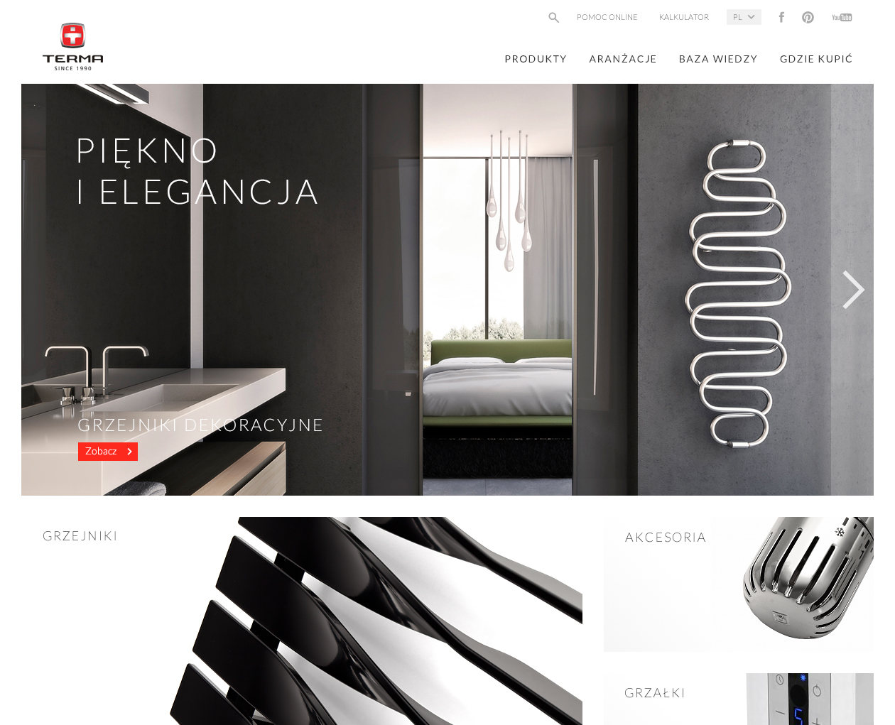
As part of the agency's work, 30 mockups and page layouts were to be created, the biggest challenge was to find a universal, visual language that would allow for placing a large number of products and related information on one page. At the same time, we wanted to reflect the modern spirit of the company and convey the individual vision behind each product. Solution The home page is divided into two parts. A slider has been planned in the main section,
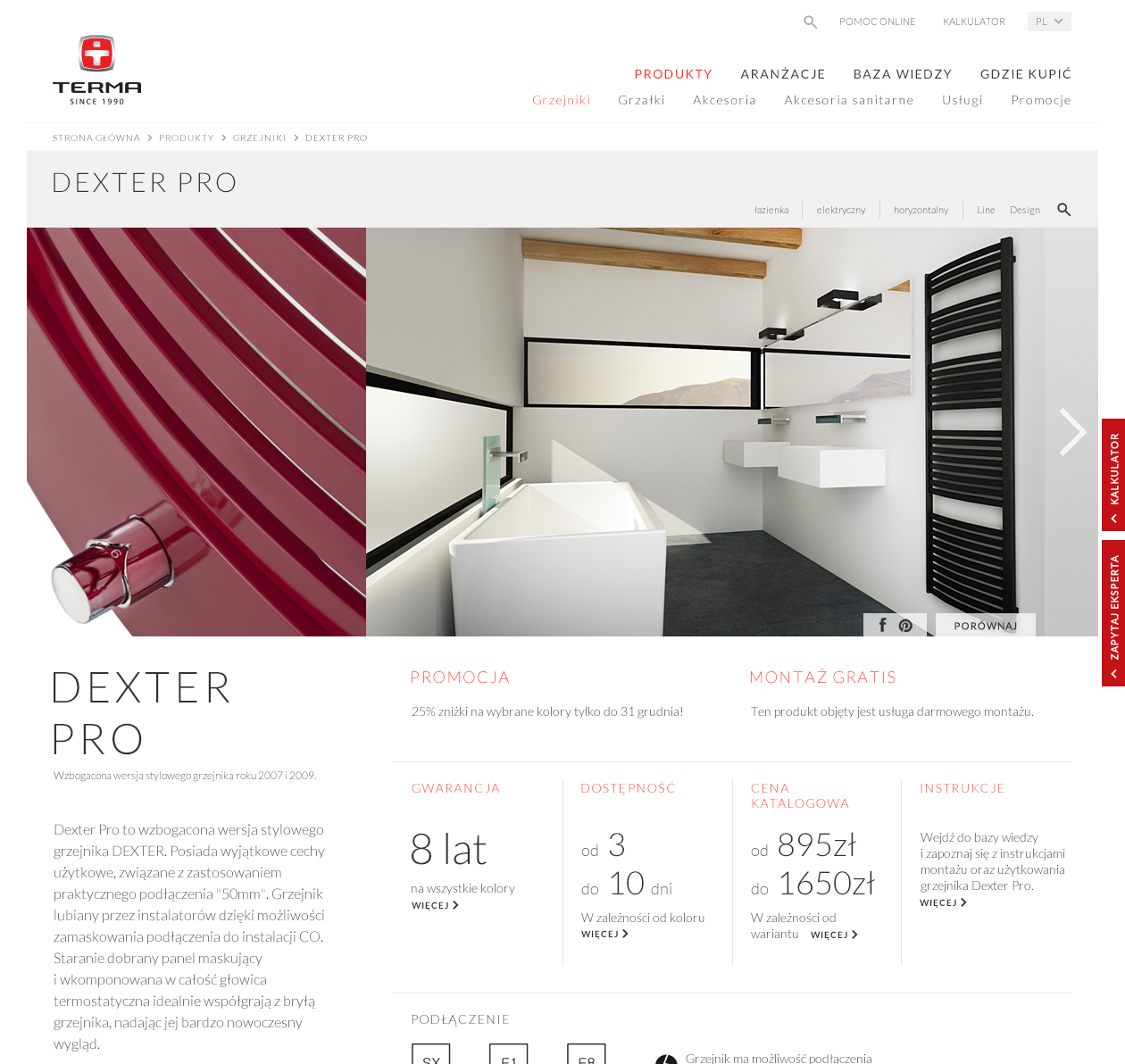
which uses photos of arranged interiors, showing products in modern interiors. Thanks to this, the website user obtained an idea about the products created by Terma Heat. Below, in a tiled arrangement, there are elegant photos of product details representing the three most important groups of Terma Heat products: radiators, heaters and accessories. All selected photographs were kept in a uniform color tone, which, combined with the previously adopted assumptions, gave the website a stylish look.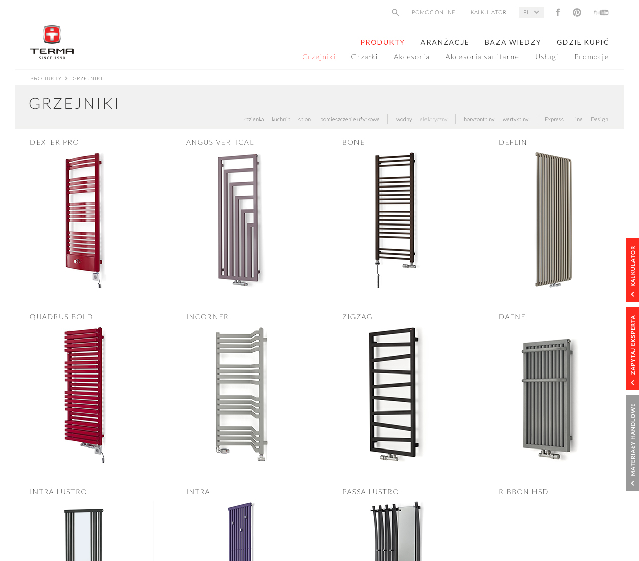 On the product page, instead of packshots, we used collages consisting of details and photos of the
interior design in which a given product is located. In this way, not only information about the
product itself was provided, but also a visualization of its functionality
in the living space. The website mock-up was designed to include the maximum amount of information while maintaining readability and transparency of the content. The information provided also included information about designers - this added a prestigious character to the radiators and enhanced the impression of good design accompanying the brand's image. The website also includes a product search form, a product list, news and a page with information about interior designers.
Challenge The biggest challenge was to find an aesthetic framework for all services and to present the
extensive range of products in a visually attractive way, while maintaining high standards of website
usability. These assumptions applied equally to the appearance of pages on monitor screens and the way
they were displayed on mobile devices. The company attaches great importance to its mission, so the
agency's tasks also included capturing the most important values for it - Kashubian origins and
respect for nature.
Solutions used We started the conceptual work by developing a well-thought-out information
architecture and planning navigation. During the work, we organized a series of meetings with the
client, during which we identified the needs of various groups of the company's clients, and its
employees selected visual proposals that best reflected the character of the company.and brand philosophy. Together with the client, we decided that the websites would be built based on a minimalist, modern design. By using white, we achieved the impression of spaciousness and cleanliness. The complementary colors were black and red, the colors taken from the brand logo - combined with light fonts, the entire project acquired a solid, professional character. This concept has been transferred to all Terma Group websites. TERMA HEAT Terma Heat is the most important service of the group. It is addressed primarily to individual customers and serves as a virtual catalog of heating products. Due to this
As part of the agency's work, 30 mockups and page layouts were to be created, the biggest challenge was to find a universal, visual language that would allow for placing a large number of products and related information on one page. At the same time, we wanted to reflect the modern spirit of the company and convey the individual vision behind each product. Solution The home page is divided into two parts. A slider has been planned in the main section,
which uses photos of arranged interiors, showing products in modern interiors. Thanks to this, the website user obtained an idea about the products created by Terma Heat. Below, in a tiled arrangement, there are elegant photos of product details representing the three most important groups of Terma Heat products: radiators, heaters and accessories. All selected photographs were kept in a uniform color tone, which, combined with the previously adopted assumptions, gave the website a stylish look.
On the product page, instead of packshots, we used collages consisting of details and photos of the
interior design in which a given product is located. In this way, not only information about the
product itself was provided, but also a visualization of its functionalityin the living space. The website mock-up was designed to include the maximum amount of information while maintaining readability and transparency of the content. The information provided also included information about designers - this added a prestigious character to the radiators and enhanced the impression of good design accompanying the brand's image. The website also includes a product search form, a product list, news and a page with information about interior designers.