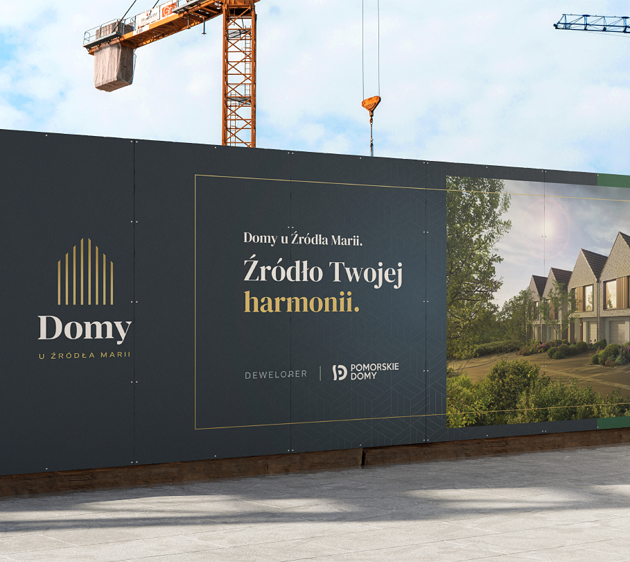
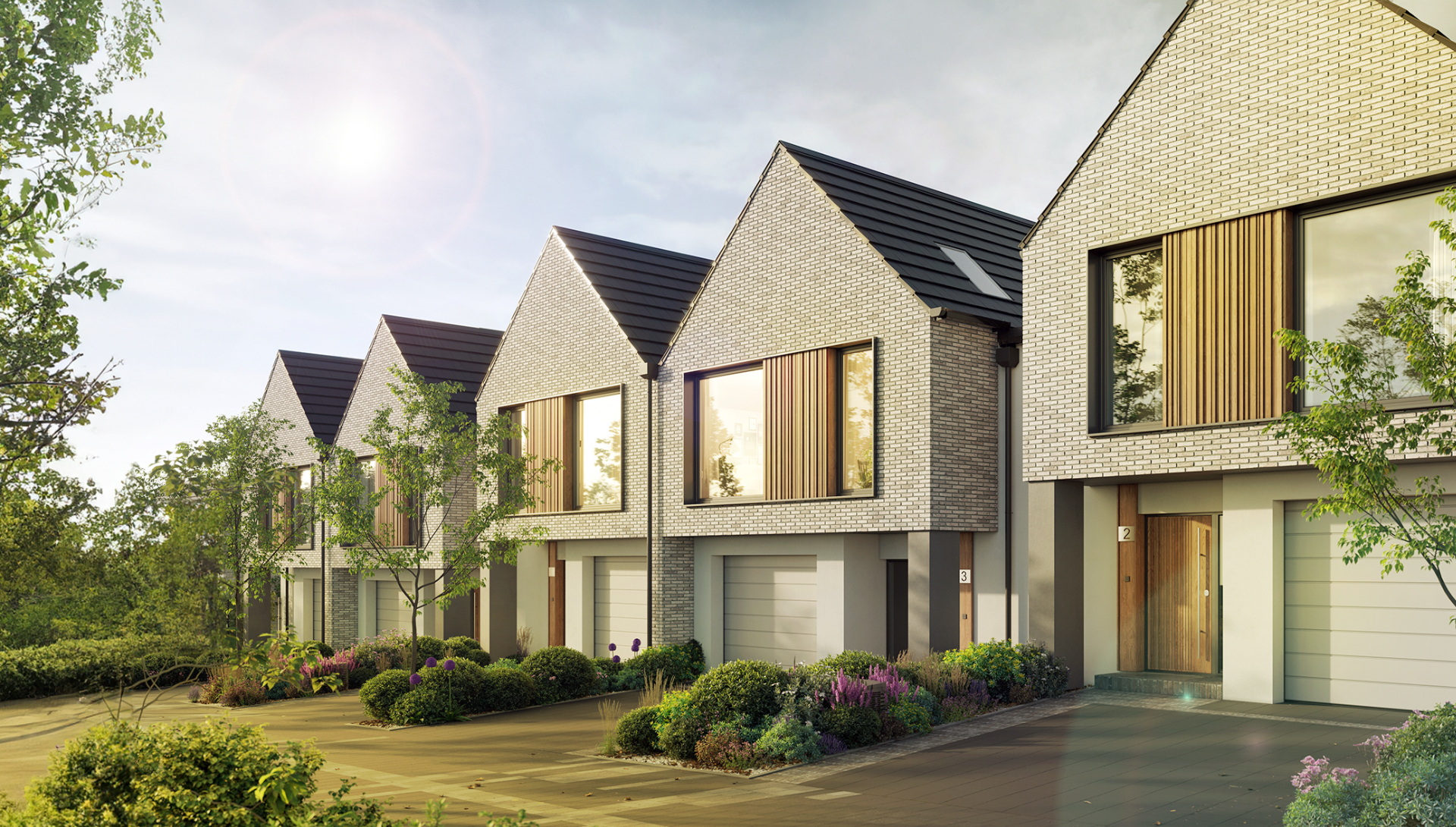
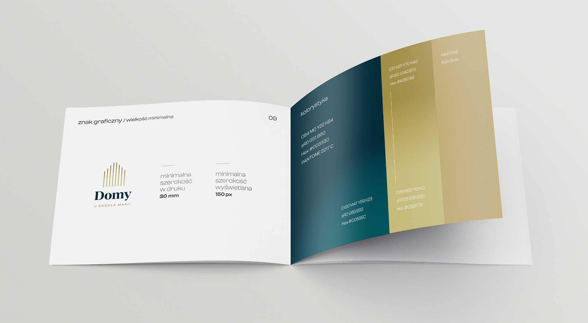
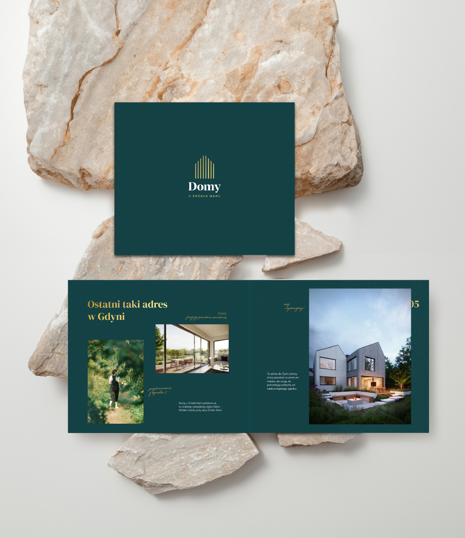
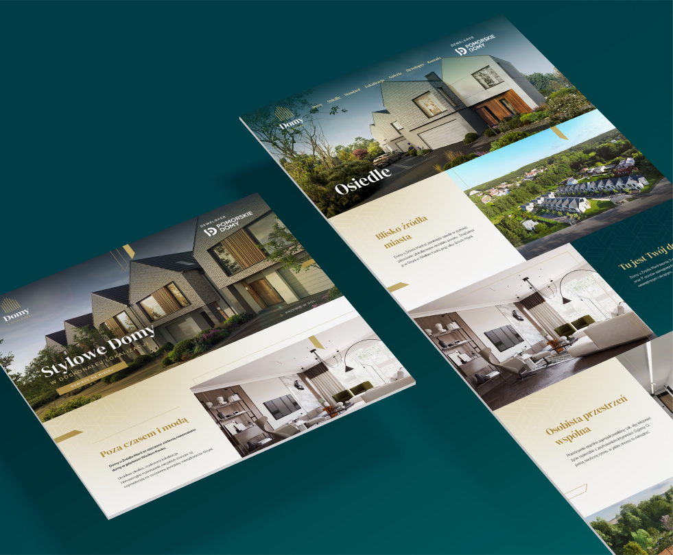
For the Domy u Źródła Marii housing development, we created a logo, brand guidelines and key visual. We translated its proximity to nature and architectural character into forms, colours and visual communication principles, which we also used in the website design.
An identity rooted in place
The project concerned detached houses by developer Pomorskie Domy in Gdynia's Wielki Kack district, near a historic stream. The communication concept combined peace and contact with nature with proximity to the city.
We chose a direction based on classic elegance. The identity was intended to express the development's qualities through restrained forms and direct references to the location and buildings.
Architecture within the logo
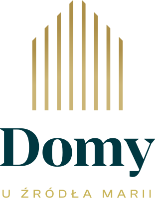
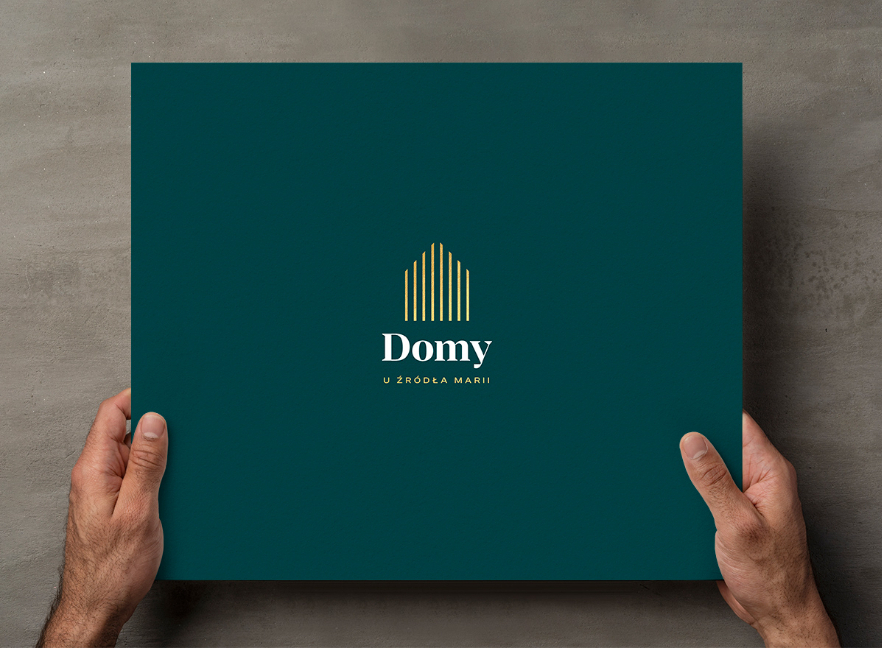
We based the symbol on the shape of a house. The vertical lines inside refer to the wooden panels on the façades, making an architectural detail part of the development's identity.
We used a gold gradient against a dark sea-green background. This combination highlights the development's elegant character and its connection to nature. The logo's form and colours tell a shared story about the place.
Logo guidelines, key visual and website design
We developed brand guidelines and a key visual, establishing clear rules for the identity's use. We then used these foundations to design the development's website.
The identity's elements grew from the location and architecture, while shared principles connected the logo with the development's online presence. The project shows our approach to property communications, from understanding a place to expressing it in a consistent visual language.