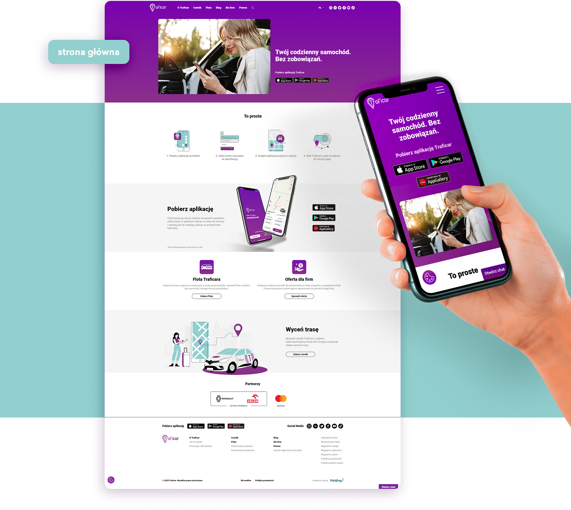
We designed and built the Traficar website, developing its structure and visual design. We focused on how to use the service, pricing and support. We connected the website layout with the app’s user experience.
Information needed before a journey
The Traficar website presents car sharing as a simple, convenient transport service. It explains how to use the app, the costs and how to get help. We planned the website for both private users and potential business partners.
We developed a structure concentrating the essential information on a few pages. We chose a minimalist direction, with large text and graphics supporting the content. The Traficar app interface provided inspiration, and we ensured consistency with its presentation of information.
Help as a central part of the design
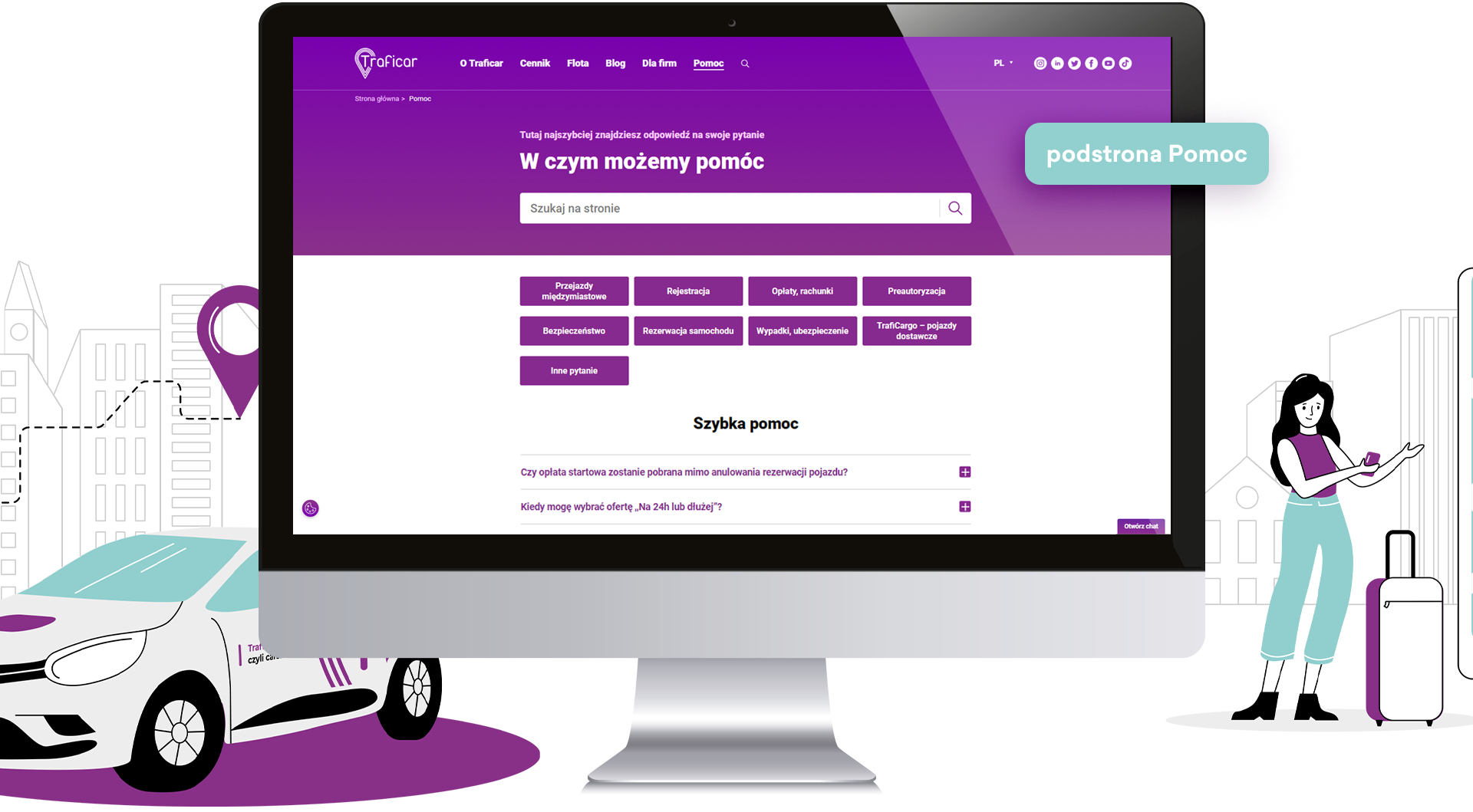
We paid particular attention to the Help page, including an extensive FAQ and Customer Service contact details. Grouping questions by topic allows users to start with the issue they face.
The Help section offers two routes to information: finding an answer independently or contacting support about a more complex issue. It connects explanations of the service with practical support in using it.
Clear pricing information
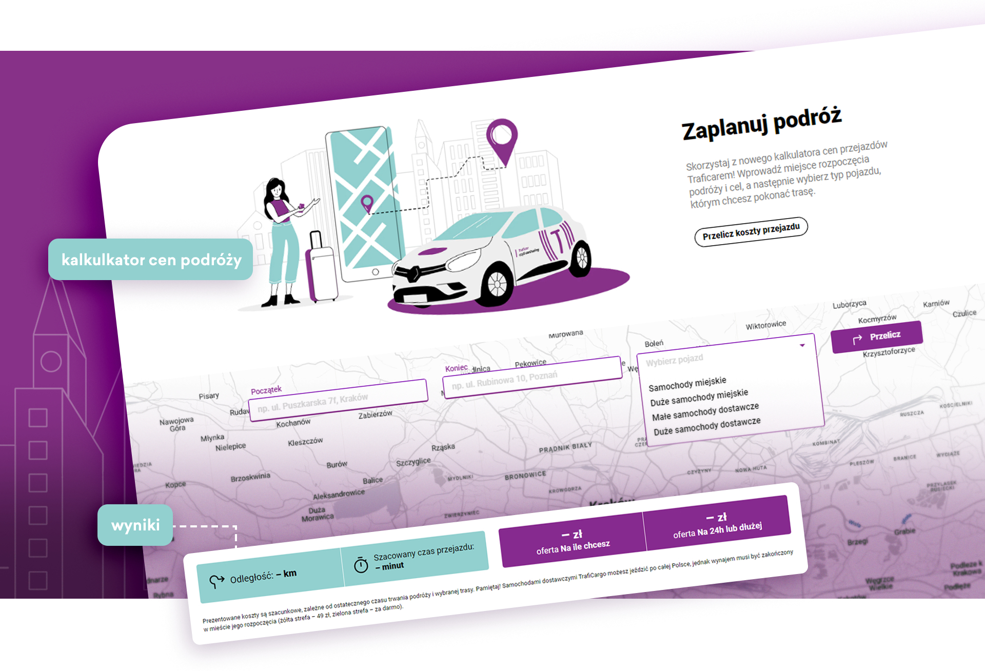
On the Pricing page, we limited content to the information needed to choose a journey. We grouped prices by vehicle type and rental duration. The design materials also included a journey cost calculator with route and vehicle selection.
The project connects brand presentation with an explanation of the service. Information architecture, help and pricing answer different user questions while sharing a consistent visual language.