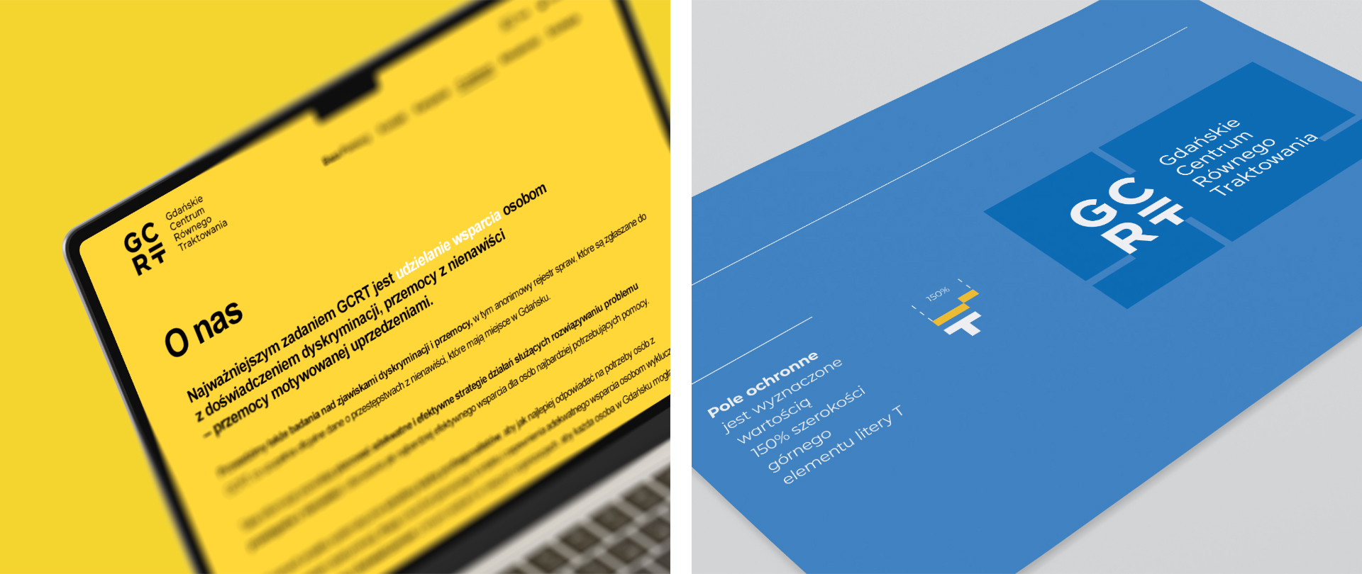
For the Gdańsk Centre for Equal Treatment, we designed a logo connecting the organisation's name with its core value. We integrated an equals sign into distinctive typography, creating an identity for use across different media.
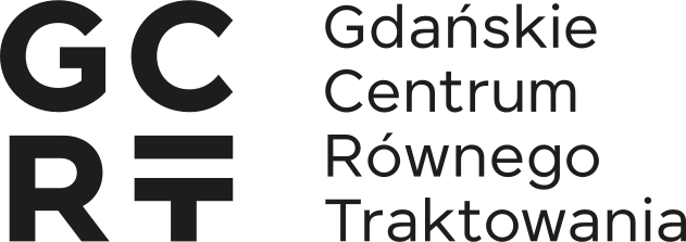
A logo for a support organisation
The project concerned an organisation supporting people who have experienced discrimination and violence motivated by prejudice. Our task was to create a clear symbol appropriate to that work.
Earlier activities by local government and NGOs, including the “Gdańsk, City of Equality” campaign, provided context. The Centre's logo needed to relate to this area of communication while identifying a specific organisation.
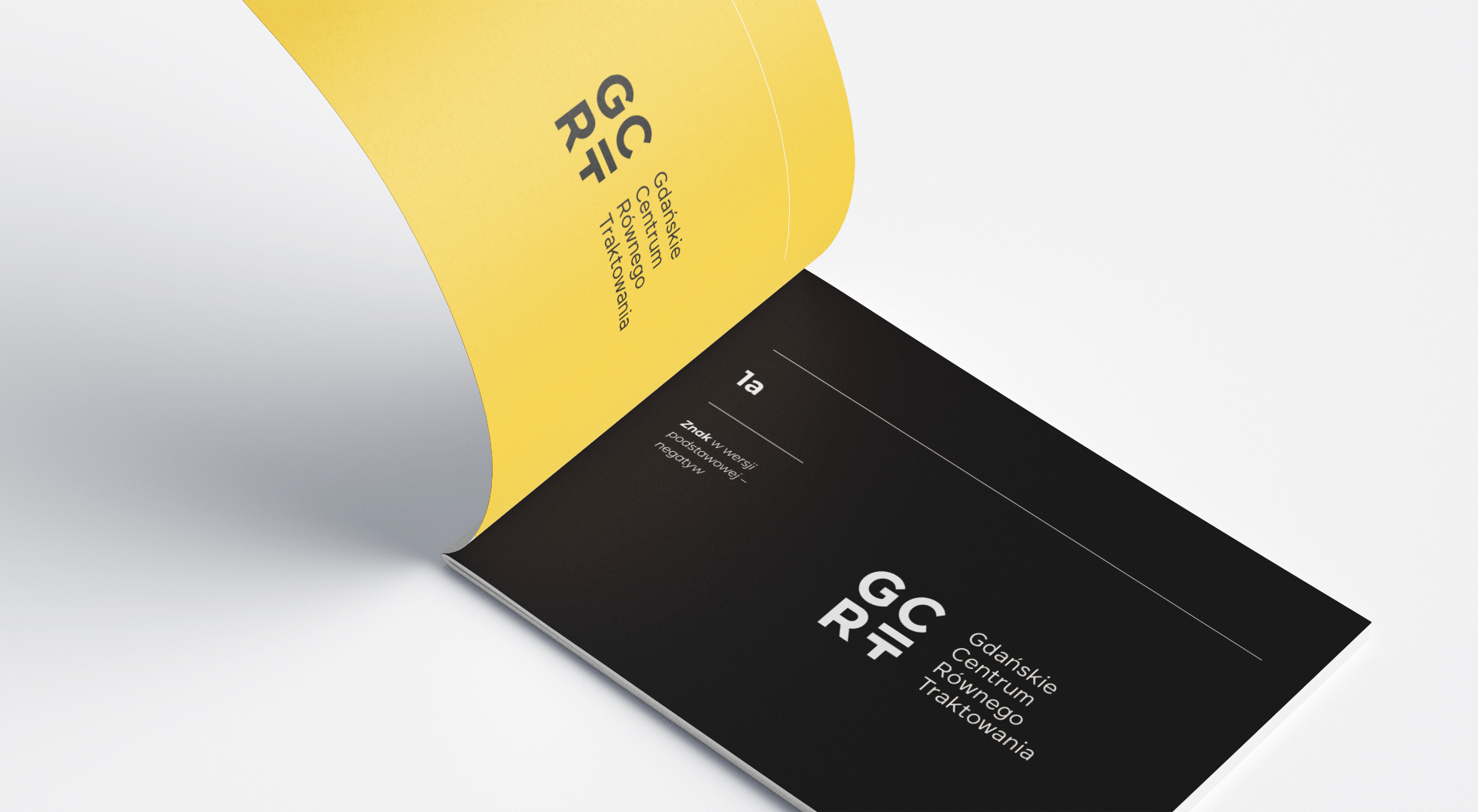
Equality as part of the typography
We chose distinctive typography and a direct symbol: the mathematical equals sign. By incorporating it into the lettering, we made the organisation's purpose part of the logo itself.
The meaning is embedded in the logo's form and connected to the Centre's name. Typography and symbol communicate a consistent message of equality.
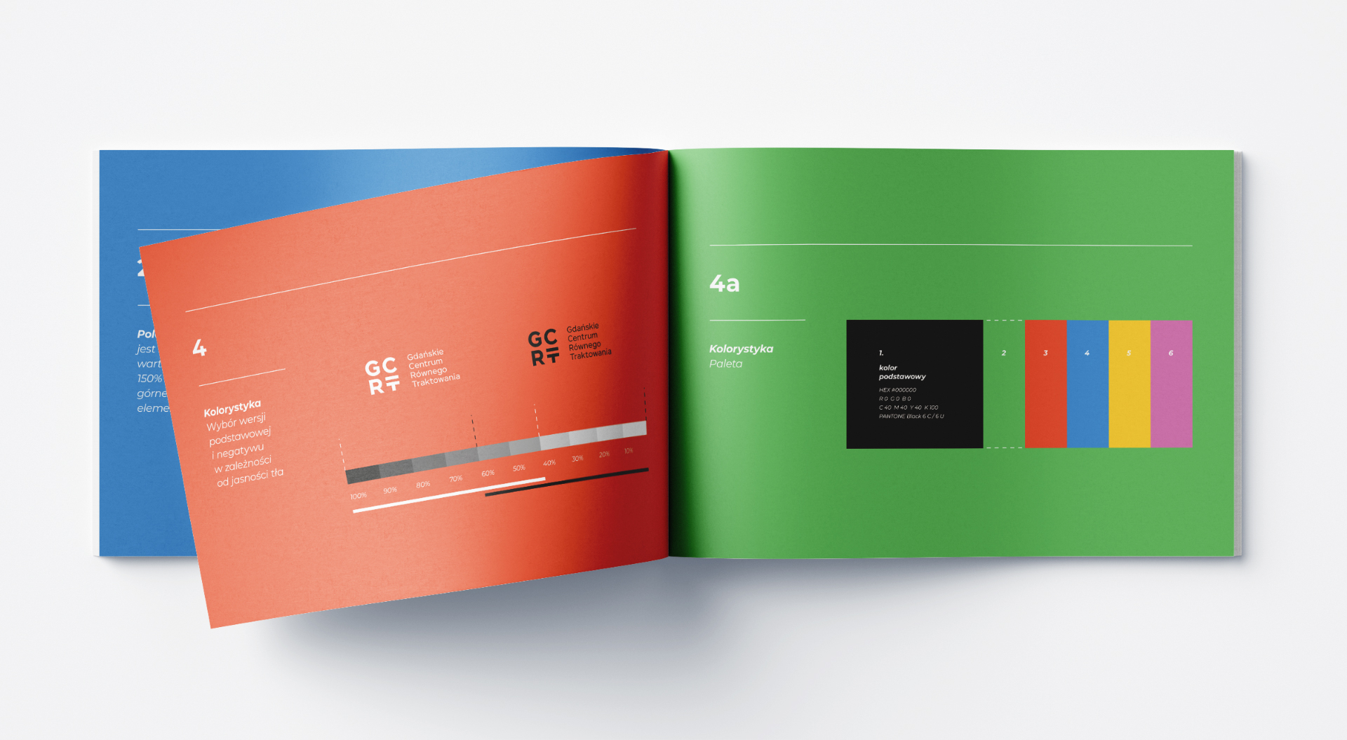
A form for different uses
We placed the initials in a square. This was a practical decision: the compact composition was designed for display in formats with different proportions.
The logo was also used on the GCRT website, which we created. It connects a social idea with the organisation's identity needs. The project shows our approach to logo design, from meaning and context to a form intended for specific uses.